Thursday, 31 March 2011
Tuesday, 29 March 2011
Fonts...


Sunday, 27 March 2011
Music For Our Teaser...
Friday, 25 March 2011
Montage Shots...
- a extreme close up shot of the womans eyes, closed at first, then suddenly opening. We've used this shot as the opening shot to our montage, with our fast paced music starting as the womans eyes open.
- a shot of the man and the villain on the floor, with the villain holding the knife and the man holding his wrist, trying to stop him from stabbing him.
- a shot of a hand picking up a knife. This shot can be interpreted in multiple ways, as the audience aren't sure who the hand belongs to, whether its the villain picking up the knife, or one of the couple picking it up in an attempt to fend off the man that's broken into their house.
- a close up shot of the woman, looking around tentatively as though she is worried that the villain is somewhere near, and then a gloved hand (meant to be that of the villain) grabs the woman by her face and pills her back. You dont actually see any more than the hand of the villain, keeping a sense of mystery around the character.
- a long shot of the woman hiding behind a wall, looking panicked. It is noticeable that there is blood on the hand of the woman, leaving the audience questioning whose blood it is. In the background, we see the lower body of a man we assume to be the villain, entering the room, holdiing the knife in his hand, he turns to walk in the direction of the woman. This shot is split into two, with the first part being shown quite early in the montage, and the other half being shown at the end of the trailer, after the title of the film is shown. The shot ends before it is revealed whether or not the villain finds the woman, leaving the trailer on a bit of cliffhanger ending, giving the audience further incentive to go and see the film when its released.
- A tracking shot of the villain from behind, showing him walking slowly through a hallway. The man then jumps out from a room branching off from the hallway, and tackles the villain to the ground. This is the only real sign the audience sees that the couple are fighting back against the villain.
- a shot of the flames of a stove, flaring up to show bright blue flames, standing out on a dark background as the lights are off. This shot's real purpose was to cut up the rest of the shots, and also the flames add a further sense of panic to the teaser.
Thursday, 24 March 2011
Todorov's Theory of Narrative...
- A State of Equilibrium
- A Disruption of the state of equilibrium through an action
- A recognition of the disruption
- An attempt to repair the disruption
- A return to a new equilibrium
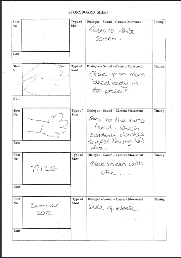
As we oursevles are not entirely sure on how our film will end, we looked to see if the 5 stages were represented in our teaser trailer. We believe that in our teaser trailer we identify the first 4 of the stages. The original state of equilibrium is seen in the first flashback, where the couple are unpacking. The second and third stages are introduced at the same time, as the disruption of the equilibrium originally takes place with the sound of something smashing upstairs, swiftly follwed by the recognition of the disruption, as the couple both hear, and look in the direction that the smashing noise came from. The recognition is preperly shown by the woman whispering 'He's here...', leaving to no doubt that she is aware that there is a man in the house, and that the 'equilibrium' has been disrupted. The first shot where stage 2 is confirmed is the shot of the villain on top of the man, attempting to choke him. Stage 2 then continues through the fast montage of shots. The attempt to repair the disruption is seen in the shot where the man takes down the villain from behind, but that is the only obvious shot of the couple attempting to take on the villain. The fifth and final stage is left unanswered, as the trailer doesn't show any shots which confirm a return to an equilibrium. Although the last shot of the man clenching his fist does leave the door open for the equilibrium to be restored, as up until that point the shots of the two bodies on the floor suggests that the villain has won and that they are dead.
Tuesday, 22 March 2011
Monday, 21 March 2011

Sunday, 20 March 2011
Saturday, 19 March 2011
Film Magazine Cover...

For the second of our ancillary tasks, we needed to create the front cover of a film magazine which would promote the release of the film in our teaser trailer. We had an idea relatively early on over what the picture on the cover would show. We wanted to the cover to be primarily black and white, with bits of red which we hoped would stand out well on the otherwise colourless picture. What we wanted to create for the cover was picture of the girl in the film, with a completely blank face, and her eyes closed, with crosses over her eyes, symbolising that she is dead. To further imply that the girl is dead, we wanted for there to be a small trail of blood running down her face, starting at her eye. Rather than creating our own fictional film magazine, we chose to create the cover to look like an edition of the well known magazine, Total Film. This was mainly because we thought that nothing we could come up with would like as professional and authentic as using an already existing magazine brand. We started off by just taking the picture, and then with the help of photoshop, we created the effect of having the entire picture black and white, with the exception of the trail of blood which stayed red. T
 hen we placed over the picture the logo of Total Film magazine. We decided against having lots of writing involving the film on the cover, and instead just having the title of the film, along with a line underneath to give people something to urge them to buy the magazine. This was something that seemed to be common on film magazine covers, being used on the covers promoting Star Trek, and Terminator Salvation. We put the title of the film in red font, to coincide with the red blood on the black and white face. The other use of red on the cover was on the 'I' of the title of the magazine, as we found when looking at existing covers of magazines, like the one promoting Inception, the title of the magazine was altered slightly, to relate to the film which the cover was promoting. We chose to play on this, by including a single red letter, to carry on the trend of a mainly black and white cover, with bits of red to both make the cover stand out, and to give the audience a hint to the type of film PRESUMED DEAD would be, as the colour red almost always gives the impression of blood.
These pictures show the progress of our magazine cover, from the original picture, to the final
 product.
Friday, 18 March 2011
Finished Poster...
 From the four pictures we had to choose from, this is the one we felt was the most effective, mainly because of the interesting angle and also that the death tag and hand were closer to the camera than in any other shot. To improve the picture we had, we changed the position of the actors names to along the top of the poster, which is where we found most posters put the names of the actors in the film. We also made the font red, to coincide with the black,white and red theme we had running through our ancillary products. The final change we made was adding in a slogan. From looking at existing film posters in the research stages, we found that alot of film posters included a small slogan which described the film in a nutshell. We chose for our slogan, 'nothings certain...not even death'. We liked this slogan as it linked directly to the title of the film, as there is no certainty that the characters are dead, it can only be 'presumed'. Also it would add further mystery to the cliffhanger ending we have in our teaser trailer, making viewers even more eager to see the film when its released as they feel they can't assume anything with the film, not even that a hand with a death tag attached belongs to a dead body.
Wednesday, 16 March 2011
Film Poster Possibilities...


To have a wider option available to us, we took photos from a few different angles, to make film posters out of so we could look and decide which we felt was the best, and would therefore be used as our film poster, after making one of the posters, we found when trying out different effects that greyscale looked much more effective, especially with the contrast between the shadow and the light. These posters we made can be seen above...
Sunday, 6 March 2011
Friday, 4 March 2011
'Presumed Dead' Storyboards...