


 cause we've planned to use the mans hand in the film poster, so wanted to use both memebers of the couple in our ancillary tasks. Also, in general women are stereotypically depicted as more vulnerable than men. Our plan is to have crosses drawn over the womans eyes to emphasise the idea that she is dead, similar to how people are shown in cartoons when they are dead or defeated, an example being when a pokemon is defeated in the cartoon show, its eyes turn in to spirals. We are also going to put blood on her face as though it is dripping down from her eye, as seeing red will instantly make a person think of blood, which coincides with conventions of the horror genre, which is well known for its use of blood.
 Film magazine covers need to be bold and stand out, as they are always going to be compared to the other magazines out at that time, and being the only thing a person will see when choosing which to buy, it is essential that the front cover is as appealing as it can be. Most films which are advertised on magazine covers, show a picture of the/one of the main characters, as they are usually the face that will remind people of the film. In all three covers i've looked at here, the main character is the only person on the cover, and looking at the camera, to make a connection with readers. The text on the front cover is also something that is made to stand out, as people wont just buy a magazine on the cover, the articles inside are what make people spend their money. On the cover for sherlock holmes, the title and subtitle for the film take up the entire bottom half of the page, as that is the focus of the magazine, and therefore the part which the magazine wants peoples eyes to be drawn to first. A common feature of a film magazine cover is to have a short phrase underneath or above the title of the film. For the Star Trek cover, the phrase 'The boldest and coolest film of 2009' is used to really sell the film, to anyone who is new to the film, and has yet to choose to go and watch it. Films with an existing reputation are able to rely less on attracting readers with wo
 rds, like the Harry Potter cover. The title of the cover film is in a list of a number of films, and while it is the only one written in bold, it doesn't stand out in the same way my other two examples do. This is something which Empire magazine can afford to do however, as by the 6th film, Harry Potter is a film franchise with millions of fans already, and simply by showing the face of Harry (daniel radcliffe), anyone who is a fan of harry potter will recognise it and want to know what about harry potter is written inside.
 I've already looked at some posters from my previous research, but i wanted to take a closer look at some of the conventions of movie posters. Just from looking at a film poster you can almost always correctly guess what genre it is, just by its use of colour and pictures. The poster for drag me to hell is a typical horror poster. The picture depicts a girl screaming, being pulled down by the arm of what looks like a zombie or something, and the flames add to the scary nature of the picture. Also the dark,dull colour of the picture in the background emphasises the genre of the film as being serious. This is contrasted in the poster for Up. The poster is made up almost entirley of bright colours, those mainly coming from the balloons on the house, but also the clear sky in the background. As well as this, the little boy (Russell) is clearly smiling, suggesting the film is of a happy nature, the complete opposite of the poster for Drag Me To Hell. The poster for burn after reading puts its main focus on the famous names starring in the film. With just a plain white background, all eyes go directly to the pictures of the people in the film, who are all well known actors, like George Clooney and Brad Pitt. Films like this, with big names filling the cast, have the option to use that as the main selling point for the fi
 lm. Films like Up, which is an animated film, dont have the option to sell the film by who is in it, as you dont see them in the film anyway, you only hear them. The film itself is formed around the concept of the house that gets lifted off the ground by lots and lots of balloons. When a film has an iconic, memorable scene, such as this, it is often used to advertise the film in all types of media, be it trailer or poster, as the majority of people who went to see Up, knew it to be the film with all the balloons carrying a house. Up also has the luxury of a very well known production company making it in Disney PIXAR, which is also put on the poster to attract any people who are fans of PIXAR, but haven't heard or seen of Up yet, knowing its a disney film will instantly gain the film audiences. Another common convention of film posters is to have a slogan, representing the story of the film, on the poster along with the title. For films like Drag Me To Hell, a couple of short sentences have been used to swiftly describe the character seen on the poster, but on the poster for Burn After Reading, a short slogan has been used to give people whose first recognition of the film is this poster, a small taste of what the film is about, it also often relates to the genre of the film.
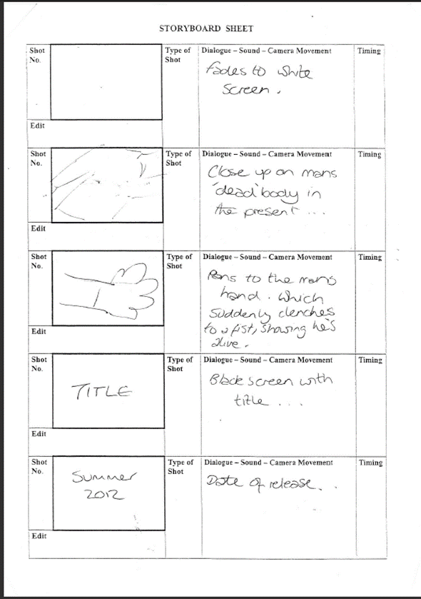
 We listed what room, and what props we would need for each of the shots we had put into our storyboards...

 Choosing a certificate for out film was made quite easy as we chose who our target audience would be first. By choosing to target the film at 16-24 year olds, we left ourselves with only one realistic option. However, this is just one of a number of reasons why we chose to make 'Presumed Dead' certificate 15. Taking in to account existing horror films, every film we looked at, both in teaser trailer research, horror trailer conventions research, and in the work we had done on our parody idea, was certificte 15.