Friday, 15 April 2011
Thursday, 31 March 2011
Tuesday, 29 March 2011
Fonts...


Sunday, 27 March 2011
Music For Our Teaser...
Friday, 25 March 2011
Montage Shots...
- a extreme close up shot of the womans eyes, closed at first, then suddenly opening. We've used this shot as the opening shot to our montage, with our fast paced music starting as the womans eyes open.
- a shot of the man and the villain on the floor, with the villain holding the knife and the man holding his wrist, trying to stop him from stabbing him.
- a shot of a hand picking up a knife. This shot can be interpreted in multiple ways, as the audience aren't sure who the hand belongs to, whether its the villain picking up the knife, or one of the couple picking it up in an attempt to fend off the man that's broken into their house.
- a close up shot of the woman, looking around tentatively as though she is worried that the villain is somewhere near, and then a gloved hand (meant to be that of the villain) grabs the woman by her face and pills her back. You dont actually see any more than the hand of the villain, keeping a sense of mystery around the character.
- a long shot of the woman hiding behind a wall, looking panicked. It is noticeable that there is blood on the hand of the woman, leaving the audience questioning whose blood it is. In the background, we see the lower body of a man we assume to be the villain, entering the room, holdiing the knife in his hand, he turns to walk in the direction of the woman. This shot is split into two, with the first part being shown quite early in the montage, and the other half being shown at the end of the trailer, after the title of the film is shown. The shot ends before it is revealed whether or not the villain finds the woman, leaving the trailer on a bit of cliffhanger ending, giving the audience further incentive to go and see the film when its released.
- A tracking shot of the villain from behind, showing him walking slowly through a hallway. The man then jumps out from a room branching off from the hallway, and tackles the villain to the ground. This is the only real sign the audience sees that the couple are fighting back against the villain.
- a shot of the flames of a stove, flaring up to show bright blue flames, standing out on a dark background as the lights are off. This shot's real purpose was to cut up the rest of the shots, and also the flames add a further sense of panic to the teaser.
Thursday, 24 March 2011
Todorov's Theory of Narrative...
- A State of Equilibrium
- A Disruption of the state of equilibrium through an action
- A recognition of the disruption
- An attempt to repair the disruption
- A return to a new equilibrium
As we oursevles are not entirely sure on how our film will end, we looked to see if the 5 stages were represented in our teaser trailer. We believe that in our teaser trailer we identify the first 4 of the stages. The original state of equilibrium is seen in the first flashback, where the couple are unpacking. The second and third stages are introduced at the same time, as the disruption of the equilibrium originally takes place with the sound of something smashing upstairs, swiftly follwed by the recognition of the disruption, as the couple both hear, and look in the direction that the smashing noise came from. The recognition is preperly shown by the woman whispering 'He's here...', leaving to no doubt that she is aware that there is a man in the house, and that the 'equilibrium' has been disrupted. The first shot where stage 2 is confirmed is the shot of the villain on top of the man, attempting to choke him. Stage 2 then continues through the fast montage of shots. The attempt to repair the disruption is seen in the shot where the man takes down the villain from behind, but that is the only obvious shot of the couple attempting to take on the villain. The fifth and final stage is left unanswered, as the trailer doesn't show any shots which confirm a return to an equilibrium. Although the last shot of the man clenching his fist does leave the door open for the equilibrium to be restored, as up until that point the shots of the two bodies on the floor suggests that the villain has won and that they are dead.
Tuesday, 22 March 2011
Monday, 21 March 2011

Sunday, 20 March 2011
Saturday, 19 March 2011
Film Magazine Cover...

For the second of our ancillary tasks, we needed to create the front cover of a film magazine which would promote the release of the film in our teaser trailer. We had an idea relatively early on over what the picture on the cover would show. We wanted to the cover to be primarily black and white, with bits of red which we hoped would stand out well on the otherwise colourless picture. What we wanted to create for the cover was picture of the girl in the film, with a completely blank face, and her eyes closed, with crosses over her eyes, symbolising that she is dead. To further imply that the girl is dead, we wanted for there to be a small trail of blood running down her face, starting at her eye. Rather than creating our own fictional film magazine, we chose to create the cover to look like an edition of the well known magazine, Total Film. This was mainly because we thought that nothing we could come up with would like as professional and authentic as using an already existing magazine brand. We started off by just taking the picture, and then with the help of photoshop, we created the effect of having the entire picture black and white, with the exception of the trail of blood which stayed red. T
 hen we placed over the picture the logo of Total Film magazine. We decided against having lots of writing involving the film on the cover, and instead just having the title of the film, along with a line underneath to give people something to urge them to buy the magazine. This was something that seemed to be common on film magazine covers, being used on the covers promoting Star Trek, and Terminator Salvation. We put the title of the film in red font, to coincide with the red blood on the black and white face. The other use of red on the cover was on the 'I' of the title of the magazine, as we found when looking at existing covers of magazines, like the one promoting Inception, the title of the magazine was altered slightly, to relate to the film which the cover was promoting. We chose to play on this, by including a single red letter, to carry on the trend of a mainly black and white cover, with bits of red to both make the cover stand out, and to give the audience a hint to the type of film PRESUMED DEAD would be, as the colour red almost always gives the impression of blood.
These pictures show the progress of our magazine cover, from the original picture, to the final
 product.
Friday, 18 March 2011
Finished Poster...
 From the four pictures we had to choose from, this is the one we felt was the most effective, mainly because of the interesting angle and also that the death tag and hand were closer to the camera than in any other shot. To improve the picture we had, we changed the position of the actors names to along the top of the poster, which is where we found most posters put the names of the actors in the film. We also made the font red, to coincide with the black,white and red theme we had running through our ancillary products. The final change we made was adding in a slogan. From looking at existing film posters in the research stages, we found that alot of film posters included a small slogan which described the film in a nutshell. We chose for our slogan, 'nothings certain...not even death'. We liked this slogan as it linked directly to the title of the film, as there is no certainty that the characters are dead, it can only be 'presumed'. Also it would add further mystery to the cliffhanger ending we have in our teaser trailer, making viewers even more eager to see the film when its released as they feel they can't assume anything with the film, not even that a hand with a death tag attached belongs to a dead body.
Wednesday, 16 March 2011
Film Poster Possibilities...


To have a wider option available to us, we took photos from a few different angles, to make film posters out of so we could look and decide which we felt was the best, and would therefore be used as our film poster, after making one of the posters, we found when trying out different effects that greyscale looked much more effective, especially with the contrast between the shadow and the light. These posters we made can be seen above...
Sunday, 6 March 2011
Friday, 4 March 2011
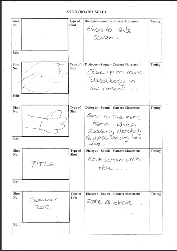
'Presumed Dead' Storyboards...


Thursday, 3 March 2011


Sunday, 20 February 2011
Film Magazine Covers...
 cause we've planned to use the mans hand in the film poster, so wanted to use both memebers of the couple in our ancillary tasks. Also, in general women are stereotypically depicted as more vulnerable than men. Our plan is to have crosses drawn over the womans eyes to emphasise the idea that she is dead, similar to how people are shown in cartoons when they are dead or defeated, an example being when a pokemon is defeated in the cartoon show, its eyes turn in to spirals. We are also going to put blood on her face as though it is dripping down from her eye, as seeing red will instantly make a person think of blood, which coincides with conventions of the horror genre, which is well known for its use of blood.
 Film Posters...

Tuesday, 15 February 2011
Film Magazine Cover Research...
 Film magazine covers need to be bold and stand out, as they are always going to be compared to the other magazines out at that time, and being the only thing a person will see when choosing which to buy, it is essential that the front cover is as appealing as it can be. Most films which are advertised on magazine covers, show a picture of the/one of the main characters, as they are usually the face that will remind people of the film. In all three covers i've looked at here, the main character is the only person on the cover, and looking at the camera, to make a connection with readers. The text on the front cover is also something that is made to stand out, as people wont just buy a magazine on the cover, the articles inside are what make people spend their money. On the cover for sherlock holmes, the title and subtitle for the film take up the entire bottom half of the page, as that is the focus of the magazine, and therefore the part which the magazine wants peoples eyes to be drawn to first. A common feature of a film magazine cover is to have a short phrase underneath or above the title of the film. For the Star Trek cover, the phrase 'The boldest and coolest film of 2009' is used to really sell the film, to anyone who is new to the film, and has yet to choose to go and watch it. Films with an existing reputation are able to rely less on attracting readers with wo
 rds, like the Harry Potter cover. The title of the cover film is in a list of a number of films, and while it is the only one written in bold, it doesn't stand out in the same way my other two examples do. This is something which Empire magazine can afford to do however, as by the 6th film, Harry Potter is a film franchise with millions of fans already, and simply by showing the face of Harry (daniel radcliffe), anyone who is a fan of harry potter will recognise it and want to know what about harry potter is written inside.
Film Poster Research...
 I've already looked at some posters from my previous research, but i wanted to take a closer look at some of the conventions of movie posters. Just from looking at a film poster you can almost always correctly guess what genre it is, just by its use of colour and pictures. The poster for drag me to hell is a typical horror poster. The picture depicts a girl screaming, being pulled down by the arm of what looks like a zombie or something, and the flames add to the scary nature of the picture. Also the dark,dull colour of the picture in the background emphasises the genre of the film as being serious. This is contrasted in the poster for Up. The poster is made up almost entirley of bright colours, those mainly coming from the balloons on the house, but also the clear sky in the background. As well as this, the little boy (Russell) is clearly smiling, suggesting the film is of a happy nature, the complete opposite of the poster for Drag Me To Hell. The poster for burn after reading puts its main focus on the famous names starring in the film. With just a plain white background, all eyes go directly to the pictures of the people in the film, who are all well known actors, like George Clooney and Brad Pitt. Films like this, with big names filling the cast, have the option to use that as the main selling point for the fi
 lm. Films like Up, which is an animated film, dont have the option to sell the film by who is in it, as you dont see them in the film anyway, you only hear them. The film itself is formed around the concept of the house that gets lifted off the ground by lots and lots of balloons. When a film has an iconic, memorable scene, such as this, it is often used to advertise the film in all types of media, be it trailer or poster, as the majority of people who went to see Up, knew it to be the film with all the balloons carrying a house. Up also has the luxury of a very well known production company making it in Disney PIXAR, which is also put on the poster to attract any people who are fans of PIXAR, but haven't heard or seen of Up yet, knowing its a disney film will instantly gain the film audiences. Another common convention of film posters is to have a slogan, representing the story of the film, on the poster along with the title. For films like Drag Me To Hell, a couple of short sentences have been used to swiftly describe the character seen on the poster, but on the poster for Burn After Reading, a short slogan has been used to give people whose first recognition of the film is this poster, a small taste of what the film is about, it also often relates to the genre of the film.
Monday, 14 February 2011
Locations and Props...
 We listed what room, and what props we would need for each of the shots we had put into our storyboards...
Sunday, 13 February 2011
Filming our Teaser...

Our plan is to hopefully get all of the shots we need in one day, as everything we are filming takes place in the same location. If we cant get everything done in one day, we may have to arrange another day for filming, to get everything done.
Saturday, 12 February 2011
Target Audience Research Conclusions...
- Everyone we asked said they would want a horror teaser trailer to scare them, as without being able to scare its audience, no film can truly be considered a horror. To try and take into account this response, we hope that we can scare people in the way that paranormal activity scares audiences, in that it makes people fear that a similar event could happen to them. Teaser trailers themselves tend not to make audiences jump, as it is just a foundation for attracting people to go and watch the film, so what we want to do is to make our teaser trailer scary in terms of making them think that this is something which could happen to them.
- A mixture of pace was something that our target audience felt was important in a good teaser trailer, as the contrast between slow paced and fast paced keeps the audiences interest. This was something we had initially wanted to do, but the feedback we recieved confirmed in our minds that we wanted to mix both slow and fast paced shots to make viewers hearts race, and intrigue them.
- Flashbacks were something that everyone we asked liked, as they felt it gave them more information about the background of the film, and also helps explain some of the confusing aspects of a film. Using flashbacks is something we definately want to do in our teaser trailer, to add an interesting aspect to the trailer.
- Our target audience told us that they prefer a teaser trailer to only show a little bit of footage of the film, as it means that less is given away. We respect this view and in some ways agree with it, but we feel that we want to use a good amount of footage, just to give the audience a chance to get a feeling for what the film is about, and hopefully want to go and see it. To try and meet in the middle on what the target audience told us and our personal wants, we know that we dont want to give away anything to do with the ending of the film, so that the conclusion of the story is kept a secret.
- There was mixed response to the usage of cliffhangers, some saying theyt didnt like not knowing all the facts, and some saying they liked being able to decide what for themselves what they think has happened. We want our trailer to have cliffhanger ending, mainly to give viewers that extra push to go and watch the film, as cliffhangers often leave audiences dyeing to know more.
Wednesday, 9 February 2011
Saturday, 5 February 2011
Certificate...
 Choosing a certificate for out film was made quite easy as we chose who our target audience would be first. By choosing to target the film at 16-24 year olds, we left ourselves with only one realistic option. However, this is just one of a number of reasons why we chose to make 'Presumed Dead' certificate 15. Taking in to account existing horror films, every film we looked at, both in teaser trailer research, horror trailer conventions research, and in the work we had done on our parody idea, was certificte 15.
- The Strangers
- The Ring
- Paranormal Activity
- Drag Me To Hell
- Mirrors
- One Missed Call
Target Audience...
Monday, 31 January 2011
Film Title...
- Awakened
- Easy Targets
- Chosen Targets
- Presumed Dead
- Breaking and Entering
- Intrusion
Friday, 28 January 2011
New Plot...
- whats happened in the last couple of hours?
- are both of them still alive?
- how did they survive?
- will the villain get away?
- what will happen next?
Monday, 17 January 2011
Horror Trailers Analysis...
Thursday, 13 January 2011
Monday, 10 January 2011
Change of Plan...
Sunday, 19 December 2010
Target Audience Research...
Tuesday, 7 December 2010
Voiceover...
Sunday, 28 November 2010
Our Scenes...
Saturday, 27 November 2010
Script...
Thursday, 18 November 2010
Zoom practice...
Monday, 15 November 2010
Mock Intro...
Saturday, 6 November 2010
Our Horror Villains (Strangers Man)...
 Strangers) This character is easily recognised because of the mask he wears, which, while simple, is different to that of any other horror villains to be created. While joined in the film by two other masked killers, seen in this picture stood on either side of him, he is clearly made out to be the leader, and the main villain, as we see him most often, and he is the one who appears in the house on numerous occasions. Apart from his mask, the man is quite smartly dressed, in a suit, but does look a bit messy. In the film, the man seems very calm, despite the frantic nature of the film, and the panic of the couple contrasts this, and also adds irony to the fact that in all their panic and running around, they can't manage to escape from the killer, who for the entire film, doesn't run once.
Thursday, 4 November 2010
Initial Idea...
Monday, 1 November 2010
Decision on films...
- The Strangers
- Paranormal Activity
- The Ring
Saturday, 30 October 2010


Wednesday, 27 October 2010
Possible Films To Parody...
- The Strangers
- Psycho
- The Shining
- Paranormal Activity
- The Ring
- The Blair Witch Project
Wednesday, 20 October 2010
Final Comments...
I like the idea of doing an action trailer, and had some vague ideas of what my film could be about, but after looking in to the genre more carefully i realised that i didn't have the resources to make a compelling and interesting action trailer. As i looked at in my research of the genre, action films are judged on the high-impact, fast paced scenes, with non-stop action in the shape of car chases, gunfights, explosions etc, being the most common and the most popular scenes. These kind of scenes are beyond what it's capable for me to do, therefore i had to rule out the prospect of doing an action teaser trailer.
After ruling out action, i was left with Horror and Comedy, both genres i was interested in doing. Horror seemed to be the easier of the two to do, and having done a thriller trailer in my AS project i felt more comfortable in thinking of possible plots and shots. However, this also meant i was interested in trying out something completely different this year, rather than going down the same route as last year.
Now i've made my final decision on what genre to go with, and i've decided on a horror parody. I liked the idea of doing a horror film, and by mixing comedy with it it means i can try out different things to what i did last year, and i also had a vague idea of which films i would use if i was to do a parody.
Tuesday, 19 October 2010
Monday, 18 October 2010
What Genre?...
- Action
- Comedy
- Horror
Friday, 15 October 2010
Sunday, 10 October 2010
Avatar Magazine Cover...

The film magazine cover for 'Avatar' doesn't tell the audience anything about the actual story/plot of the film, but instead signifies the coming release of a film thats been anticipated for over ten years. Unlike the previous two magazine covers i've looked at, this cover really says more through what is written than it does through the picture. The picture shows a medium length shot of the main characters avatar looking at the camera. While giving no hints of the storyline, it does emphasise that the film is based more around the Avatars than the humans controlling them. The picture also leaves no question on what film this character is from, as the avatars and the navi are completely unique looking from characters in any other films. With the anticipation around the film, people will want to read this magazine as soon as they set eys on the cover, which is probably why a medium shot has been used, so people will know what film is being advertised on the cover even by looking from a distance. The background is a blue picture of something, but is blurred to the point where there is no way of knowing what the picture shows, leaving peoples focus to lie completely on the avatar. The picture also covers up part of the magazines name, something which is used quite often on magazine covers to ensure that all the focus remains on the content of the cover. The writing underneath the picture is what really will sell the magazine. The title of the film, 'AVATAR' is shown in big font, coloured white to stand out clearly infront of the blue avatar. Along with this, in small writing just above the title, it says 'intergalactic exclusive!'. Being in small writing, this is probably something that the magazine hopes to be the tip of the iceberg for people who don't know whether they want to buy it or not at first glance, may be swayed into doing so once seeing that the information on the film cannot be read anywhere else. The subtitle underneath the name of the film reads...
'A Decade in the Making'...'But how long will we feel the force of James Cameron's sci-fi epic?'.
These short phrases will attract anyone who has been looking forward to the release of James Camerons new film, his first since the hugely successful 'Titanic'. People who don't know much in detail about the film will be interested to find out more. Having the decade in the making phrase slightly bigger than the rest of the subtitles around the cover means it will be one of the first things a person will read when picking up the magazine. Even for a person who isn't aware of all the hype around Camerons latest film, will be intrigue by a film which has been worked on for over ten years, and therefore is likely to buy the magazine to find out more. Mentioning James Cameron's name at the bottom will also be something that may persuade people to buy the magazine, as there are few people who don't know who James Cameron is, and many people will be sold just at the mention of his name.
Overall, the magazine cover for Avatar, rather than giving people a little clue at the plot or the background of the film, it is, much like the teaser trailer, used to build further hype around the release of the film, and make people even more eager to see the film as soon as it is released, a tactic which we now know was a very successful one.
Saturday, 9 October 2010
The Dark Knight Magazine Cover...

In all, the magazine covers promoting the release of 'The Dark Knight' give nothing new away about the film, which for people who are dying to know more, will make them want to buy the magazine and read more. Also, with the film being highly anticipated, the importance of attracting people through magazine covers isn't as high, so the introduction of the rival covers, to see which side readers are on, gives the magazine a unique selling point to keep it interesting.
Friday, 8 October 2010
Inception Magazine Cover...

This cover for Empire film magazine says a suprisingly large amount about Inception, despite not looking like much. The title INCEPTION is written in large red letters in the middle of the cover, which make it stand out from the rest of the writing on the cover is smaller and black (apart from the name of the magazine). There is a quote underneath the word inception which looks like a quote from someone who has seen the film. It reads 'the matrix meets 007 on steroids'. This quotes already has given any readers who have seen the Matrix films or the James Bond films an idea about what the film is going to be like. By linking it to the Matrix, it suggests the film questions reality in some way, using postmodernism as a feature of the film. By linking the film to the James Bond series, the film is likely to involve alot of action and detailed fight scenes. The picture on the cover is of Leonardo DiCaprio. This is not suprising as a popular feature of the film is the fact that he is the main character, and therefore anyone who wasn't planning on seeing the film may be persuaded by seeing him on the cover of the magazine, making clear that he stars in the film. The background of the picture looks to be an overhead shot of a city, which links to the use of city shots in the teaser trailer. That, and the fact that DiCaprio is wearing a smart suit, gives away hints of the industrialised settings, and the businessmen like characters involved in the film. Not an obvious on first glance, we can see that he is holding a gun in his hand, which leaves no doubt that there is going to be action in this film and there is likely to be people getting shot. This reinforces the link between Inception and the two movies mentioned in the quote, The Matrix, and James Bond.
This film poster manages to give away some hints about the film just from the cover but not enough to leave the audience thinking theres nothing else to know, therefore making them buy the magazine, and go to watch the film. It also uses the same tactic that the teaser trailer used by focusing on the fact that there is a well known actor in the film, to bring in new audiences.
Wednesday, 6 October 2010
Avatar Teaser Trailer...
The teaser trailer for Avatar is another teaser trailer which uses almost no dialogue, but includes a huge number of small clips from the film in order to give the same level of detail away without spoiling the story for the viewers. The trailer is almost set in two halves, with every aspect of the trailer changing at the half way point. At the very beginning of the trailer we see a shot of a satellite like object floating in space, followed by a shot of a rocket from the satellite shooting through the air. The next shot we see is of the forest, and the man exiting the rocket. This immediately tells the audience that the film is not set on planet earth. For the first minute of the trailer we see short clips of all sorts of machinery, and we see the man in the wheelchair looking around and looking closely at the machines, as though he is as new to all of it as we, the audience are. There is a shot of the man looking at what is soon revealed to be his avatar, and then watch the process of him turning into his avatar. At almost the exact half-way point of the trailer, we see the only bit a dialogue said throughout the trailer, as the mans avatar says 'this is great'. This line is almost the trigger which switches the pace of the trailer. While all of the shots in the first half had been very slow and calm, the second half of the teaser sees everything speed up, as the content of the clips becomes more intense, aswell as the speed between clips. In terms of sound, the music used in the first half is more like diagetic sounds, and with just long lasting notes, which sound almost like a strong wind. This too is changed by the middle of the trailer, where he becomes his avatar, as the music becomes louder, and there is an apparent drum beat, which also increases as the trailer continues, the change in music plays in sync to the increase in action shown in the clips, as the further into the action the teaser goes, the faster, louder and more intense the music becomes. Another aspect of the teaser trailer that turns at the half-way point is the mise-en-scene. The first half is consumed by shots of technology and machinery, implying that they are dependant on all of the machines which they use. We also see clips of people strapping themsleves into robot like machines, which gives the audience a hint to what is shown later, that the humans are battling against the navi. Again, after the main character truns into his avatar, the clips shown are almost all set in the forest/jungle, showing a more natural side to the planet where the film is set. The mise-en-scene is also used to emphasise the battle between man and navi, as they differ totally in all aspects of life: the men have, robots, planes, and guns. The navi have dragons and bow and arrows. The editing of the teaser is especially important in this case, as it is the main factor in setting the mood and pace of the trailer. With so many short clips being shown, it gives a chance for interesting editing, which is used to the full effect. There is a mide variety in pace of shots, with them mostly being calm, and slow at first but turning fast and intense towards the end. Also the use of slow motion clips throws something interesting into the trailer, particularly in the shot near the end where the beast jumps at the mans avatar, which can only really be appreciated by being slowed down to give the audience a chance to see everything. With the trailer containing so many shots, the variety in camera angles is huge. We see shots from all levels, as the camera follows the dragons and planes in the air, and the robots and the horses on the ground. We also see shots of the battle from both sides (man and navi) which keeps the audience in the dark as to who are the 'good guys' and who are the 'bad guys'. One of the most important parts of the teaser trailer is the reveal that the film comes from the director of Titanic. Where Inception played on the fact that a big name was starring in the film to attract audiences, Avatar is able to play on the fact that a big name was directing the film. James Cameron had not directed a film since Titanic, and there had been alot of specualtion about what his next film would be, so by announcing that Avatar is Camerons returning film, this will undoubtedly intrigue lots of people, and therefore as well as people coming through interest in the film, the trailer will also attract audiences who have been eagerly awaiting James Camerons new film, be it a film they think looks good or not, they'll want to see it.
Overall, this film is unusually long for a teaser trailer, but the obvious question to audiences will be, who wins the battle, the humans or the navi? As this question is not answered through the trailer, it will not put many people off going to see it. Other aspects which have to be taken in to account for the length of the trailer is the slow pace of the trailer at first, spending a minute to set the scene, something few films include in their teaser trailers. Also, the length of the film itself is three hours, which inevitably means that it could show double the amount without spoiling the film, as it is twice as long as the average movie.
The Dark Knight Teaser Trailer...
The teaser trailer for The Dark Knight, almost the complete opposite of the teaser trailer for Inception, depends almost completely on the use of dialogue, as theres very little else to it. The trailer begins with a completely black shot, with nothing happening visually, but you can hear people speaking. It qucikly becomes clear that it's two men having a conversation. Without it giving much away about the film, you can gather that they're about a group of people, who we are led to belive are the bad guys as they've 'crossed the line', and have turned to someone out of 'desperation'. The focus of the conversation then switches the the 'someone' who was mentioned, with one of the men saying 'some men just want to watch the world burn' in relation to this man. From the conversation, we, the audience immediately get a sense that the film is about Good vs. Evil, with this 'someone' being the ringleader of the Evil side, and the men having the conversation being the Good side. From their voices, some people may be able to recognise who is talking, and therefore figure out qucikly what film the trailer is for. While the conversation is happening over the shot, streaks of blue light start to appear, and slowly become bigger and more frequent until at the end of the two mens conversation, the Batman symbol can be made out clearly. This is the point of the trailer where most viewers will click that the trailer is advertising the new Batman film. This is a technique which will put some people, such as those who dislike the Batman films, off watching it. However, it is mostly a clever move as there is a huge amount of people who love the Batman film and will be sold by the trailer the instant the emblem is revealed, but it also gives the trailer a chance to attract more people who aren't sold simply by the knowledge that it is a Batman film. After the two mens conversation, another voice begins to speak, saying that 'people will die', suggesting to the audience that it is now the villain of the film speaking, backed up by an evil laugh as he finsihes speaking. While the villain is speaking, the Batman emblem begins to wear away and crumble, as the blue lights become even bigger and brighter, almost engulfing the entire screen. As the evil laugh happens, a picture of the original joker flashes past the screen, revealing to the audience that the joker is infact the villain of the film. This will both intrigue new audiences, who want to know more, and excite those who are already aware of who the joker is and will be shocked and excited by the reveal that he is back. For the mise-en-scene of the teaser, it plays a suprisingly important role given that there is only one shot in the entire trailer. The emblem itself gives the audience alot of infromation about the film. The shot and the dialogue play in sync, so as we hear Batman speaking, the emblem begins to show and come through the darkness, showing the return of the Batman series. Also, the emblem crumbling as the Joker speaks shows that his plan is to destroy Batman, revealing the the audience without showing them anything that the film is going to be about Batman vs. The Joker. The music begins quietly during the first conversation, consisting of a low hum and regular drum beats which play in sync to the streaks of lights. The music begins properly as the first conversation ends and the joker starts talking, suddenly becoming a very fast paced piece of music, building a lot of tension and adding some excitement to the trailer. The music then dies down as the picture of the joker comes towards the screen, signifying the seriousness of the film.
Overall, this teaser trailer is just under one minute, which is just longer than the normal length of a teaser trailer, the trailer gives little other than the basic outline of the film away, yet its main selling point is the fact that it is the new Batman film, which in itself will attract huge audiences. It doesn't need to include lots of shots and information to attract new audiences, as the Batman franchise, similar to the Toy Story franchise is already popular world wide, so the teaser trailer has the luxury of being able to be extremely basic and simple, yet staying effective.
Sunday, 3 October 2010
Inception Teaser Trailer...
The teaser trailer for Inception depends totally on music to set the mood, not having any dialogue throughout the trailer. It is a good example of how a teaser trailer can be made, as despite not hearing a word be spoken in the trailer, the audience still gets a sense of what the film is about, through watching, reading, and listening. The trailer begins by introducing the director of the film, 'Christopher Nolan', for viewers who know of and enjoy his films, this will immediately be a selling point for the trailer. For those who don't recognise the name, the next shot tells the audience that he was the director of 'The Dark Knight', a popular film which more people are likely to know of, this quick outlet of information may give people the reason they were looking for to carry on watching the trailer. The music/sound for the entire trailer is a very low, slow paced at first tune, which beats in time to the change between shots, this helps the trailer to flow more smoothly. The shots in the trailer start of relatively obscure, with a spinning top, and an overhead view of a city, neither of which give away any obvious information about the plot of the film. The trailer also puts alot of focus on Leonardo DiCaprio, who is the main character in the film, he is the only actor to be mentioned in the teaser, as well as the main focus of a number of shots during the trailer. This is a tactic used when there is a big name involved in a film, just having them starring in the film instantly attracts all of that stars fanbase to the film. The shots of the film which are shown give nothing away about the storyline, but do give something away about the genre of the film, and the type of people in the film. A number of the shots shown involve action, like the fight scene nearing the end or the man being dragged away, which suggests the film is partly action. Also all of the characters we see are men wearing suits, which could be a way of showing the audience the kind of characters which the film has to offer. The camera shots are relatively simple at first, such as the spinning top and the glass of water, which are both close ups on a level height to the objects. The range of shots does vary more as the trailer goes on though, with the tracking shots of buildings with the dialogue on the screen, and the extreme close-ups towards the end. The mise-en-scene of the teaser trailer does give the impression that the film is a high-tech, city based film. This is due to the numerous shots of industrialised, modern cities, including the shot of the helicopter on the roof of a building. It also gives a sense of postmodernism, with shots of the glass of water lying at an unnatural angle, as well as the fight scene, which shows the room spinning as the two men running towards eachother, giving a sense that the world they're in may not be real. Without dialogue being spoken, the trailer relies on showing short phrases during the trailer to explain the story slightly. The phrases read 'your mind''is the scene of the crime'. This lets the audience read into it whatever way they want to, keeping a sense of mystery about the film. The editing of the trailer is relatively straight forward, probably so as not to take away from the actual content of the trailer, using a faster pace of shots as the trailer goes on, which matches the rise in speed of the music.
This teaser trailer is nearing the longer end of how long a teaser trailer should be, but can afford to be longer due to the methods it uses to give the audience a feeling to what the film is about.
Friday, 1 October 2010
Teaser Trailer Research...
I'm going to research three films which i've seen and three films which i haven't to make sure i have a variety of each, as well as any additional trailers i analyse.
Another reason for doing it this way is that i had difficulty finding examples of all the ancillary products for the three films which i had seen. While i was able to find and analyse film posters for all three of them, i couldn't find film magazine covers for any of them. For this reason, i looked into film magazines and found three films which i hadn't seen, which had all been on the cover of a film magazine.
My initial three films that i have seen are:
- Toy Story 3
- Red Eye
- The Strangers
My initial three films that i haven't seen are:
- Inception
- Avatar
- The Dark Knight
Monday, 27 September 2010
The Strangers Movie Poster...
 The poster for 'The Strangers' plays on the vulnerability of the two main characters, particularly in this poster the woman. The mise-en-scene of the poster shows one of the large, empty rooms in the house which the film focuses on. The woman is stood in the room alone, which could be for a number of reasons. Firstly, generically we see a woman on her own to be more vulnerable than a man alone in the same position. This also could be for the reason that the woman (Liv Tyler) is a better known actress than the actor who plays her partner in the film (Scott Speedman). The still frame from the film shows the male killer lurking in the shadows behind the woman. This not only plays on showing the audience something the character isn't aware of, making us feel included, as well as to show that the man is in the house and the woman has no idea. Like 'Red Eye', the film poster for the Strangers also has a phrase/slogan at the top of the poster. It reads 'We tell ourselves theres nothing to fear, but sometimes we're wrong'. This phrase links with the idea that the woman feels safe being in the large house, but in fact is in more danger because of it, as the big house has allowed the man to get in without alerting her. The title is positioned at the bottom of the poster, in a white font to make it stand out on the shadowed area in which it's placed. The title, 'The Strangers' links to the identity of the killers, as a 'stranger' is considered as someone who we do not know personally. The killers in the film make sure to stay 'Strangers' through the masks they wear to hide their identity from their victims.